Heyo, recently while reading/watching stuff about random old computers I kept seeing references to, or glimpses of, a few alternative GUIs that some computer manufacturers included with prebuilt machines throughout the 90s. These alternative GUIs often abandoned the 'desktop metaphor' of the base operating system for an even more skeuomporh-heavy 'room metaphor', or created their own unique looking interface to show off the computer's multimedia capabilities. These are an interesting 'what if' in the history of user interface design, and I wanted to share some that I think are neat.
Sections
- Microsoft Bob
- Packard Bell Navigator
- Compaq Presario Gallery & Plaza
- Sony VAIO Space
- 3DNA Desktop
- Honorable Mentions
Why do they exist?
The idea behind most of these seems to be providing an easier experience for people learning how to use computers, as this era had a huge uptake in new PC users, and home users in particular. Prior to this, most desktop GUIs and software were tailored towards business users, and even if they had obtuse UIs or complicated features, business users could benefit from training provided by their employer. Home users didn't have easy or free access to that kind of training, so it was often harder to get used to the interfaces of Windows 2.0-3.1, Mac System 7, or OS/2.
Most GUIs of the time, and to this day, use a 'desktop metaphor' i.e. they virtually represent the top of an office desk. You pull 'files' from a 'file manager' (cabinet or drawer), and place them on your desk-top to interact with them. This is skeuomorphic design; elements/design cues replicated in a derivative object in order to make it easier for the user to understand. Stuff like the 'answer call' icon on your smart phone being shaped like an old handset, or the 'save' icon in modern software looking like a floppy disc or CD. The manufacturers who put out these alternative GUIs probably figured that the desk-top might be a confusing concept for home users, as not everyone works a desk job. That and desktop GUIs just weren't as well featured and streamlined for home users, as they would become a few years later.
For these home user GUIs, they usually provided more home-like skeuomorphs/metaphors. Rooms that you do specific activities in could be navigated to virtually; an office for work, a living room to watch media, a library for accessing stored data, and usually a separate kids room. That's typically as far as they could go, it's not like you can cook on a computer or use the bathroom, lmao. Eventually they were kind of just beaten by how simple and easy to use Windows 95-98, Mac OS 8-9, and others (NeXTSTEP, BeOS) became by the end of the 90s. Also, some of these offerings were baked in as the standard GUI of certain prebuilt PCs, requiring complicated config edits to return to standard Windows, and ruining any good faith in the process.
Why are they interesting?
For me, they come from an 'exciting' era of tech stuff, where people and companies actually experimented and tried new things from time to time. Design of most stuff from this period was highly stylized, which firmly locks them in time and makes them look dated today, but I find it all more visually interesting than the homogenised flat design that dominates now. There was very much a 'wow' factor to 3D stuff like this as multimedia computers were in their infancy, and the technology powering them kept rapidly improving in such a short amount of time. And while I don't want to be too nostalgia baiting, I was a child during this time so the idea of what is 'good design' or 'exciting' is certainly effected by me going through multiple developmental stages while a maximalist style was in fashion, cementing it in my mind.
As mentioned in the intro, I also think they provide an interesting insight into what 'could have been' if any of these became a standard computer interface style. Imagine if today the 'way you use a computer' is by moving around a 3D environment into different rooms like your 'office' to do work, and click on the TV in your 'living room' to watch media. Or imagine if our standard computer interfaces weren't still centred on the desk-top, that they were more interactive and game-like. None of this happened, but these ideas keep coming up in tech related stuff, most recently in the realm of VR/metaverse crap, so they seem to retain their novel 'this is the future' status.
On the inverse of what I just said, they are also just VERY funny, like the idea that I've gotta engage in gameplay from the likes of Myst, the Sims, or a Sierra adventure game in order to use my computer is hilarious. It conjurs up imagery of sitting there struggling with the fire marble puzzle from Riven trying to open settings or something. And like, OF COURSE they didn't take off, they add minutes of load time and 3D virtual navigation to a task that can be done in a few seconds by clicking icons on a desktop with your mouse. No matter how cool or interesting I think these things are, it would just be such a cumbersome way to use a computer.
Examples
There are some youtube links throughout this section, consider using an alternate front end like Freetube, Newpipe, Pipepipe, Materialious, etc.
Microsoft Bob
This one is mind boggling, because it released in the same year as Windows 95 which generally addressed a lot of issues people had with Windows 3.1. It did come out a few months before 95 though, and was likely in development for some time to target home users of Windows 3.1, which makes more sense. It bombed within a year, again because Win 95 was intuitive enough for almost anyone to use, but some characters were re-used in later MS software, most notably Clippy.
It has a digital 2D pixel art style, reminiscent of point and click adventure games or hidden object games from the time, think Sierra or LucasArts. Used the room metaphor, having you navigate between them in order to access programs and files. The rooms were customizable, see some resources below:
- The Microsoft Bob Experience: Was It Really THAT Bad? - LGR (youtube video)
- Microsoft BOB v1.00 (OEM) (CD-ROM) - archive.org (install media)
- Microsoft Bob page - GUIdebookgallery.org (collection of articles/ads/screenshots)
Packard Bell Navigator
This had a couple of iterations, initially it was just an alternative desktop GUI in versions 1-2, with nicer looking colour visuals compared to Windows 3.1. It then became a '3D' room metaphor interface with versions 3.x in 1995. For context, because I can't remember the last time I saw this brand, they were typically the third or fourth largest PC 'manufacturer' throughout most of the 90s, competing with Compaq and usually just behind IBM and Apple. Naviagtor was pre-installed on most of their PCs as a startup/boot program, but could be installed on other computers.
The 3.x versions look a lot more like a Myst clone, the type of pre-rendered '3D' that while it was real 3D objects at one point (on the silicon graphics workstation of the developer), all scenes are pre-recorded and played back as an interactive set of videos for the end user (often using quicktime). This oozes 90s 3D charm, the style of the house kinda looks like Fraiser's apartment or something, and the kids room looks like a lot of fun. Highly stylized menus and arguably overcomplicated tutorials.
There was also a final version released in 2000 (Packard Bell 3D Navigator) that is a true 3D virtual home, allowing you freedom to walk around between rooms. Looks and controls similarly to 3D virtual worlds of the time like ActiveWorlds, with the house having a very 'modern' southwestern/californian style. See some resources below:
- Packard Bell Navigator 3.0 (1995) - The Nostalgia Mall (youtube video, no voiceover)
- Packard Bell 3D Navigator - MattBytesRetro (youtube video, no voiceover)
- Packard Bell Navigator - A Retrospective and Demo - Michael MJD (youtube video showing 2.0 & 3.5)
- Packard Bell Navigator 3.9 Tutorials - GUIdebookgallery.org (overview/screenshots of tutorials accompanying 3.9)
- Archive.org search "packard bell navigator" - (install media) there are so many versions that I don't want to link them individually, with a brief scroll here you can find them all here
Compaq Presario Gallery & Plaza
Two offerings from Compaq bundled in with their Presario range of prebuilt PCs through the latter half of the 90s. Again, Compaq was a third or fourth place PC 'manufacturer' at the time, and they previously had a Navigator 1.0-2.0 style alternate desktop called TabWorks. Gallery and Plaza were only offered as pre-installed software, so they're usually only available from specific Presario restore discs.
Gallery is the first iteration released in 1995-6(?). You are presented with one '3D' room with masonry and columns that resemble an art gallery. On either side are some icons to click to access utilities and information.
Plaza is an 'improved' version from 1996 onwards, with an outdoor mall plaza setting. Lots of masonry, tiling and gold trim, the stuff that was 'classy' at the time. You click on storefronts of the mall or street signs in order to access applications, tutorials, and information.
Both of these feel more like generic bloatware, or glorified launchers, than a full GUI replacement. They also do pre-rendered 3D and have little to no virtual navigation, so they aren't as interactive as Navigator or even Bob. See some resources below:
- Compaq Presario 9500 Series OOBE & Presario Gallery - Vintage Tech Rescue (youtube video)
- Compaq Presario 9500 Quick Restore - archive.org (restore disc media that includes Gallery)
- Compaq Presario 7100 Series Presario Plaza- Vintage Tech Rescure (youtube video)
- Compaq Presario 7100 Quick Restore & CD Bundle Volume 1 - archive.org (restore disc media that includes Plaza)
Sony VAIO Space
A pre-installed GUI included with Sony multimedia PCs from around 2000. These don't use a room metaphor, instead creating a unique 'futuristic' 3D interface that is reminiscent of video games of the era, as well as a compiz desktop cube. VAIO space provides a 3D depth to it's interface with multiple view screens allowing to access groups of programs and features, with unique little 3D control icons spinning on a dock at the bottom. As you click to change view screens it plays a warping noise and wipes the screens in that direction. Definitely more in the realm of glorified launcher, but far more interesting looking and useable than Presario's offerings. See some resources below:
3DNA Desktop
An independent full 3D virtual home GUI environment for your PC from the early 2000s. The default 'loft' space has a very 00s 'silicon valley startup' style with exposed brick, high ceilings, and large windows, reminds of the movie Antitrust. There was the option to download or buy several other home spaces though. This looks A LOT like how ActiveWorlds would have at the time, same tank movement controls, similar texture quality. A lot of pieces of this GUI are customizable, you can move objects, add personal photos into frames, and fix up a custom wall of your browser bookmarks with pre-rendered thumbnails. It stays pretty simple and intuitive with an 'applications' desk, 'media' desk, and the 'browser' wall. See some resources below:
- 3DNA Desktop - A 3D Desktop Replacement for Windows 98-XP (Overview & Demo) - Michael MJD (youtube video)
- 3DNA Desktop Collection - archive.org (install media)
Honorable Mentions
These are some I came across that are also interesting but are a bit more limited, harder to get information about, or aren't full GUIs
Apple eWorld: A cute cartoon internet interface that shows you a little town in which you can click on themed buildings to access different sites or internet related software. Reminiscent of hub worlds from games like Club Penguin, Neopets, or Purble Place. Operated between 1994-1996
- eWorld Tour for Performa Macintosh - goldfishcrayon (youtube video overview)
Magic Cap: An operating system originally for palm/mobile devices offered between 1994-2001 that uses a room metaphor. It has a charming pixel art style that looks like if Habbo Hotel offered a first person view. There was also a Windows version available from 1996.
- Magic Cap - GUIdebookgallery.org (collection of articles/books/screenshots)
A.C.E (Acer Computer Explorer): Acer's pack-in desktop replacement from around 1995. This was more of a glorified launcher/bloatware thing and visually more like TabWorks or Packard Bell Navigator 1.0-2.0.
- The First Acer Aspire! $2,500 Windows 95 Desktop PC from 1995 - LGR (youtube video) the A.C.E desktop is shown from about the 13 minute mark
Ark Workspace: I can't find any other info on this apart from what is written in the archive.org link below. Released in 1991 for Mac System 6/7 and billed as a 'project management software', while it does offer the room metaphor, that room is an office with a desk-top front and centre, kind of like a hybrid between the two. Visually the environment loooks like a render from architecture or CAD software from the time.
- Ark Workspace - archive.org (install media with a good overview in description)
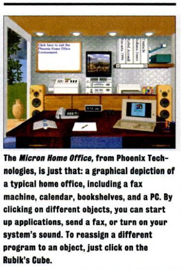
Micron Home Office: Another one I can't find any info on, the individual terms micron, home, and office have pretty saturated search engine results. Came across this from some post that linked to a google books copy of PC Magazine 20th Dec 1994; '11th annual awards for technical excellence'. On page 194 a section titled 'Windows Front Ends' features a little write up on this, along with a few others mentioned earlier. Looks like a more Myst style version of a static office space with interactable objects. Outrageously, it uses a rubik's cube as the settings/configuraiton button.
- Micron Home Office - screenshot of just the Micron Home Office write up from PC Magazine 20th Dec 1994, p.194
Osaka OS: A modern room metaphor GUI operating system with a very late 80s-early 90s Sierra adventure game looking retro art style. 'Meant to emulate the experience of a videogame or demo' according to the creator.
- osakaOS github page
- osakaOS: the Best Operating System? - tirimid (youtube video)
Thanks for reading!